todays totorial was a very interresting and had lots of areas that had a lot of food for thought with in it.
first I am going to show you the two worked in concepts I have done so far, phil adressed my same concern with them, on them looking cloudy.
this is the first part I did
these are the bomber with the top gunner slightly changed
what came up in the tutorial was that the top gun turret, made the bomber feel too small, and that the texturing looks too cloudy.
I tottally agree with him on this, as when I was designning this, I was looking at too mutch of smaller bombers, like the WW2 Heinkel he 111, and also limiting my self too mutch on the scale and design.
phil prompted me to start looking at vehical concept design. This really did help, I feel that this hit the nail on the head and I have been starting it wrong.
(
These concepts below are not my own and I am not taking any credit for it)
metaninja.
com
http://eat3d.com/forum/contests-and-challenges/high-poly-vehicle-scappelle1
cheo36
http://thenewcaferacersociety.blogspot.com/2008/11/deviant-art-cheo36.html
I feel what I have been doing wrong is, creating the designs straight from black and struggling on creating the forms and the shapes along with perspective and size.
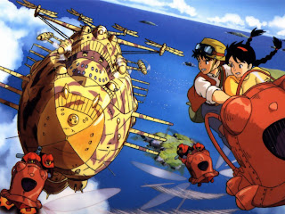
This is were I would like to point phil to, and ask the question of is this scale now too large for the person, as Ive forgoten my first ever main influence, and that is Laputa castle in the sky, with the big heavy bomber.
You may also see that I have put one of the men in the engine and thought maybe that men could have engine rooms powering the engines, or even another gun port or weapons area.
I feel that this would be a better scale for this bomber, or somewere close.
Also I have neatened up the silhouettes in photoshop, from quite messy lines to very smooth lines.


