Archive for February 2011

latest maya tutes


singing in the rain


Strike!


scene enterpretation from the book


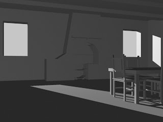
This scene is my interpretation of the fagins den 


Bill Sykes den, I cant wait to start texturing this soon

The walls and ceiling of the room were perfectly black with age and dirt. There was a deal table before the fire: upon which were a candle, stuck in a ginger-beer bottle, two or three pewter pots, a loaf and butter, and a plate. In a frying-pan, which was on the fire, and which was secured to the mantel-shelf by a string, some sausages were cooking; and standing over them, with a toasting-fork in his hand, was a very old shrivelled Jew, whose villanous-looking and repulsive face was obscured by a quantity of matted red hair. He was dressed in a greasy flannel gown, with his throat bare; and seemed to be dividing his attention between the frying-pan and a clothes-horse, over which a great number of silk handkerchiefs were hanging. Several rough beds made of old sacks, were huddled side by side on the floor. Seated round the table were four or five boys, none older than the Dodger, smoking long clay pipes, and drinking spirits with the air of middle-aged men. These all crowded about their associate as he whispered a few words to the Jew; and then turned round and grinned at Oliver. So did the Jew himself, toasting-fork in hand.

this is the descrption that I am working from


3D texturing in photoshop

Talking to Elliot last week, he mentioned about texturing and importing a 3d model from Maya into photoshop and then texturing it in from there, searching around on the Internet, I came across a few tutorials up on it. 


though texturing the object seemed quite slow, and I think this is due to that photoshop has to render the texture as you paint it, or that it may have been a graphics issue.


as you see here there are a few issues to where there are what seems to be glitches up on the texture, I'm not too sure on how to over come this. I have also UV'd this as well which helped a lot from what it was, so maybe it could be to do with the UV's or a graphics or rendering issue I'm not sure.

dynamics tutorials

Coke Can


Barrel


The funniest thing I found with this tutorial was that I axcedently linked the gravity to the barrel instead of the dynamics, and was funny to see the barrel lift up, as i wasn't expecting it.

wood beems


The beems seem very dark in this image, though the flooring still needs more improvement into it aswell

tutorials


I cant help noticing that the colour comes out as green, I'm not sure why this is, as I look through the tutorial and I cant seem to see what I'm doing wrong, I have been thinking it maybe just the monitors but, I'm not sure, it could be that I've typed the script in wrong but I'm really not sure.

texture testing

The texture on the wall is taken influence from the oliver twist 1948 version.  the first image looks quite flat where as with the other I used a texture overlay to bring out the texture.


I feel that I'm getting steps closer to my final texture, though these don't have bump maps, due to being in a game world. I've changed the floor from floor boards to tiles as I think this would make a much more better effect within the scene, and a good way to test it out when I come to building the real scenes, the main success is the lighting within this scene, with the beams shining through. I must also keep going back and not forgetting the influences like Limbo and Ico.


lighting and texturing tests


I'm not sure wether I prefer the blue back ground of the grey.


This is a basic texture at this moment in time, but I feel that the lighting is coming allong quite nicely. I also would like to put a bump map up on the texture to bring out the black lines of the brick, but also these need to be refined allot more, the world its self is not certain.

This is an small description from the book of oliver twist  

"THE ROOM in which the boys were fed, was a large stone hall, with a copper at one end: out of which the master, dressed in an apron for the purpose, and assisted by one or two women, ladled the gruel at meal-times."


from Oliver Twist
by Charles Dickens


lighting tests


my first lighting tests

first of the first maya tutorials


finally completed these tutorials last night, I still yet to do the head of the game character, I sense a very heavy weekend of work coming up so I'm glad I have these, it would be really cool to have the bomb to be able to detonate as well.

THICK FOG!

THICK FOG!


I'm glad to say that the dynamics tutorials are finally underway through many difficulties of the computers at uni not having Maya, and also my Maya computer not having the Internet at home, I've been pretty stuck, though now I've found my solutions and now have stuff progressing.


TEXTURE TESTING


All day I've been battling with texture, though this is a simple test scene, I think maybe I'm trying to run before I walk I'm not to sure. this is not yet finished but is something closer to what I want. The room is lit with a normal ambient light but most of the texture its self is carrying the depths and shading, I have saved everything in step by step PSD's for if do need to refine or configure the texture at any stage I can then do so. Though this is a render with its finalized texture, of this style I have kept and saved all the original textures before it. At this present time I'm not sure on what the world or final scenes are ever going to look like at this moment I feel that through more tweaks and experiments, I feel I will have this great world of Oliver twist/Gustave Dore game concept in hand.

hand drawn concept peice


this is my most recent hand drawn concept piece, and first of the official peices. This is of olivers work house scene, you may also gues that I have not used a ruler with in this scene as I didn't have one at the time, but this is my first official 16:9 A3 concept (16:9 in inches) I did it this way through that I could express and draw more better and gather in more details, though as I express this is done in the style of Gustave Dore. I remember thinking after this I'm glad I didn't use a ruler as on my smaller concepts with rulers, they looks too robotic and plain, where as this I felt that it ismore expressive. In this concept I'm also trying to gather the style of Gustave Dore.

Today I went to the library and brought out a book that is amaizing to me


you can really see the details of the images inside and it is amaizing peaces of work.

the League of extraordinary gentlemen

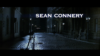
I saw the other day the League of extraordinary gentlemen, while watching the begginning, some of the scenes ispered and reminded me of some of the look of that I'm going for with in London, though these scenes are brief.


 incoring the subtitals and though in this shot it is rainning, this is the kind of feel I would like, disaturated and dull


 I love allot of these scenes due to the atmospherics.


As being encouraged to watch the black and white version of Oliver, I have found some good inspirational scenes, scenes 0:40 to 0:53 and 1:30 to 1:32 are both brilliant in a way of the games style of Gustave Dore's, and atmosphere.

wall texture testing


testing out the texture and styles for walls, as you see this is just a basic texture, that I've created in photoshop, put up on a basic wall. through doing this I'm trying to create the world of what it may look like plus creating the Gustave style, as I say this is only the first attempt of many more experiments to come.

"Actual"... London

Today I went to Spitalfields market in the east end of London, look and get first hand account of the east end Lodnon streets.

it was amaizing to look at these buildings and imagen how it used to be back in the victorian era, with old small cramped streets and small shops like this.

trying to grab as mutch visuals for textures and elements for the game, and details.


I was with my brother at the time taking these


this building really took my eye for its neglect look and feel about it


taking note of the hight and the wall pattern.
which kind of was annoying about these buildings was the paintwork, it seemed to take it out of its origenal state "modernised"


Taking the shots from out side the market was hard due to the public walking arround and getting in the way, so some of these take on a more touristy feel to them, but still trying to pick out the details


This buildiing cought my eye for that it was very diffarent to what I had seen from all the other buildings, though dasly at the bottom were modern shops. I find that allot of buildings have allot more character above the shop line. 


Taking note of the small areas and details of building is key.


When coming to building the scenes with in the project its self, I'll choose two scenes and highly refine them, for game. Taking note of my convesation with phill and creating scenes with amaizing atmosphire to them. I have finally got my hands up on two oliver twist books (one to read and one to doodle, take notes and highlight in) 

phill encouraged me to look at the black and white version of oliver, to build up on the atmospheric style of the scenes. 

he also showed me a game called Limbo inwich taking note of the atmophire of the game and how it looks and also another game called ICO. when creating the textures, styles and atmosphire to my scenes, I will look strongly from the scetches and drawings from Gustave Dore's. When playing this game, I feel allot of it should be very disaturated colours. expressing the influence of Gustave Dore's and deep textures.